Bibaswan
I design enterprise systems
that people actually use.
Senior Product Designer (UX) specialising in complex B2B SaaS — multi-role workflows, admin systems, data-heavy interfaces, and mission-critical platforms where design decisions have real operational consequences.
Projects that
moved the needle
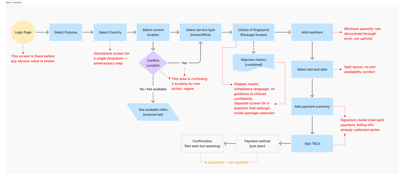
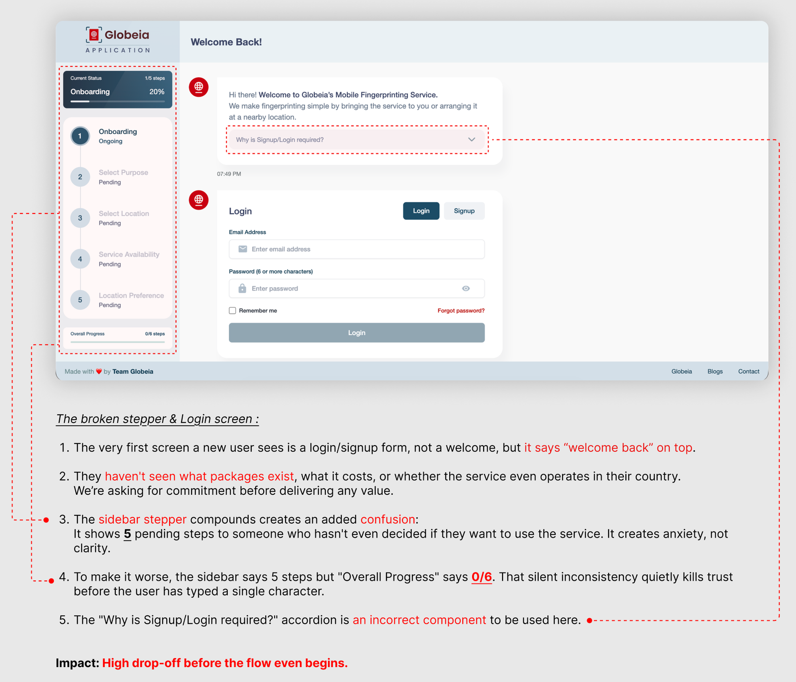
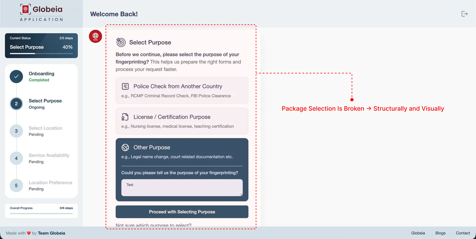
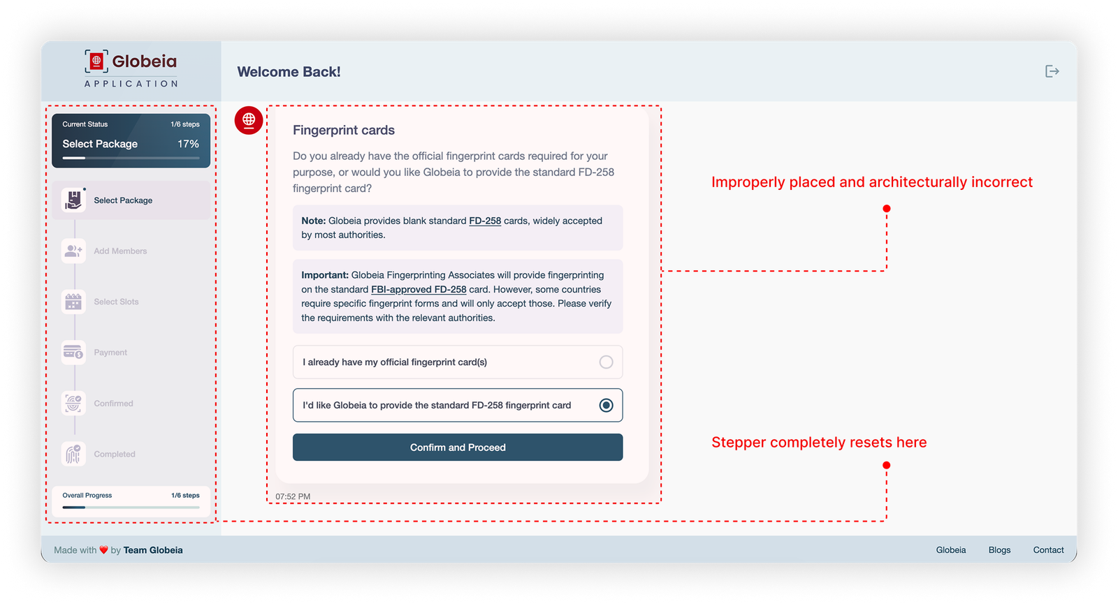
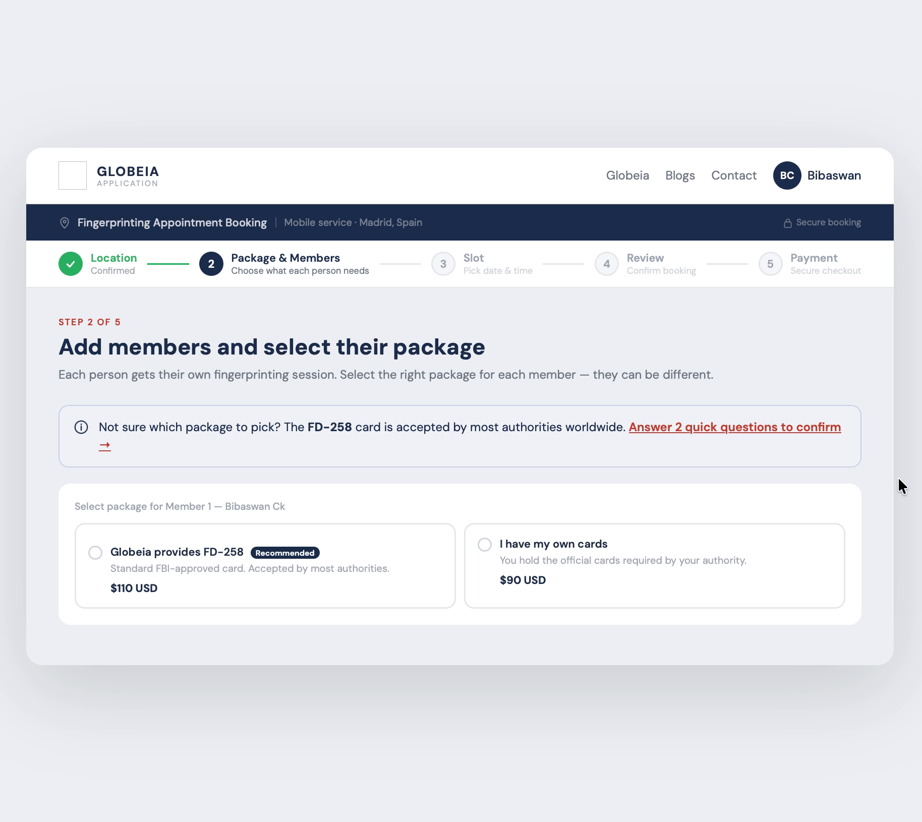
Fixing a broken
workflow
with AI assistance
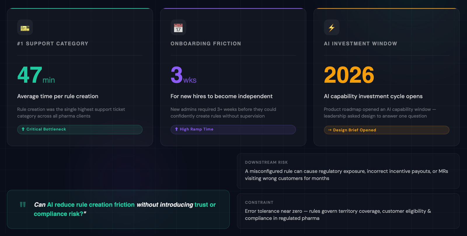
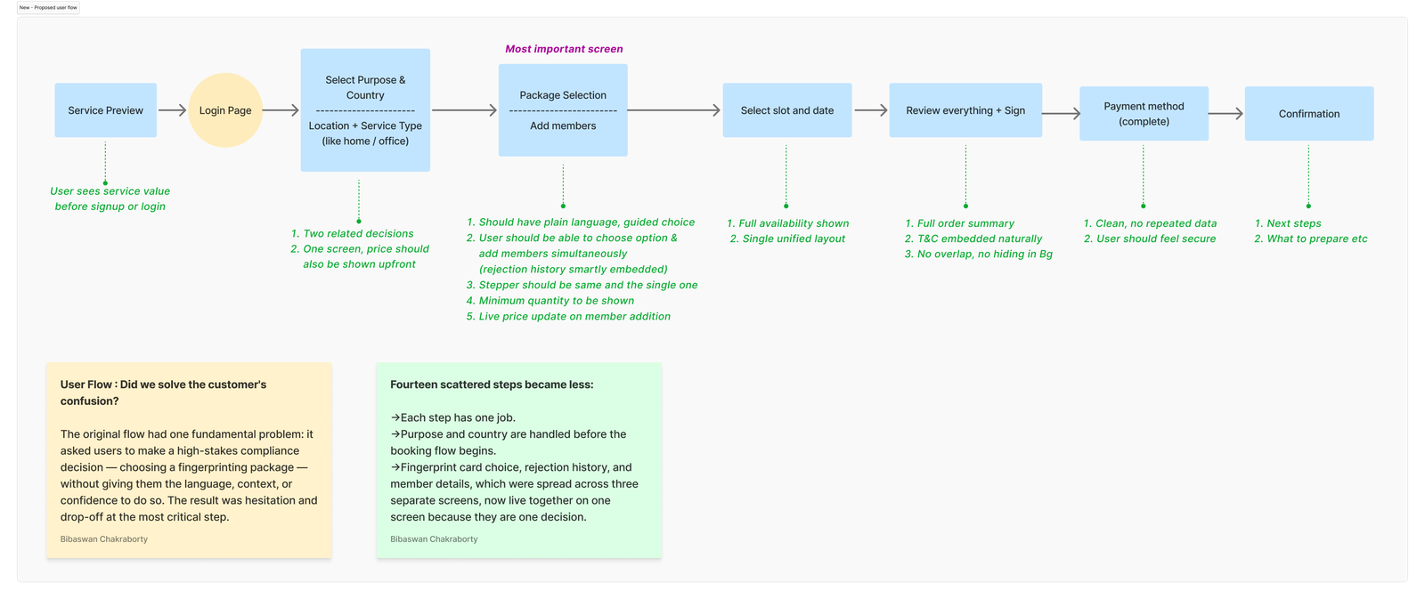
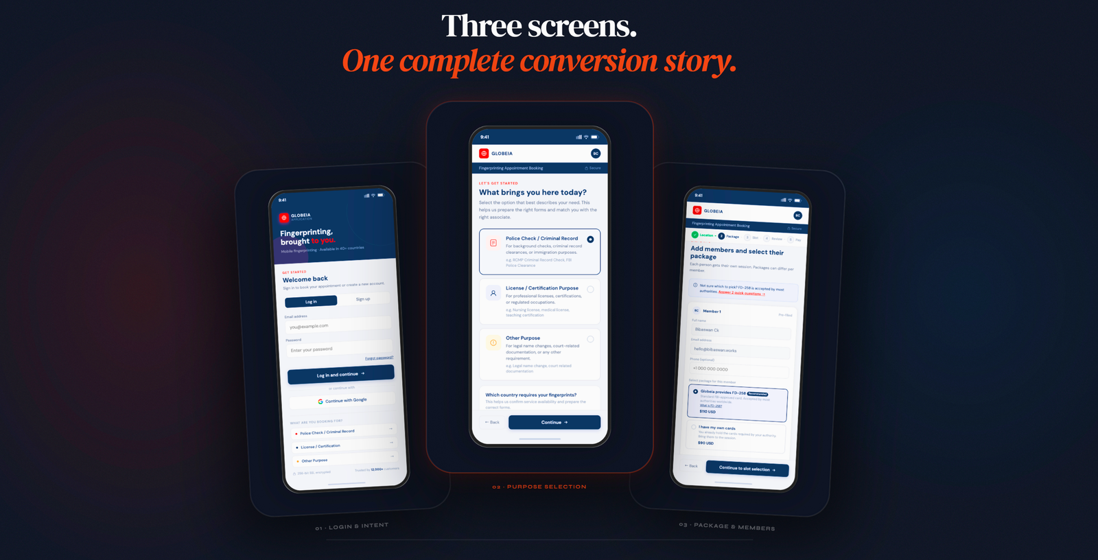
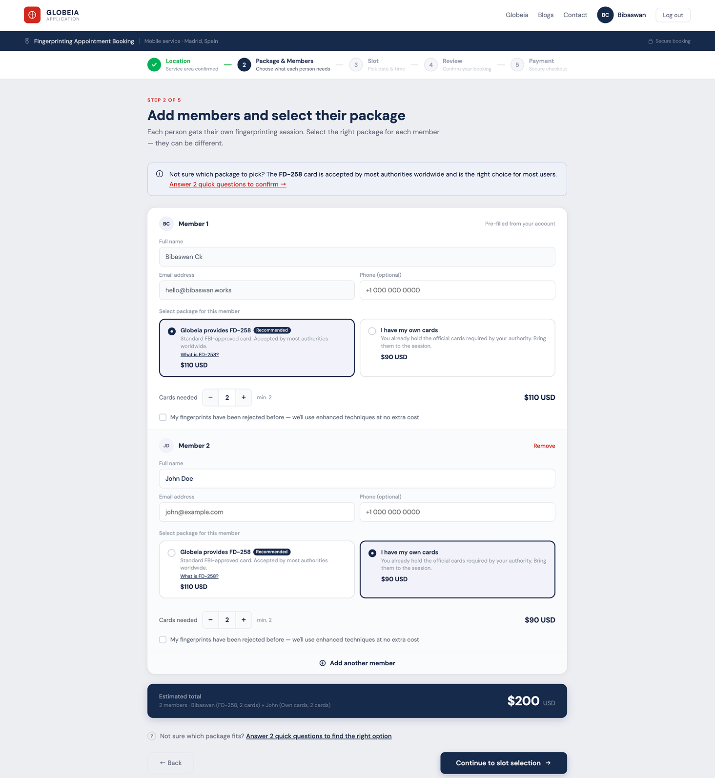
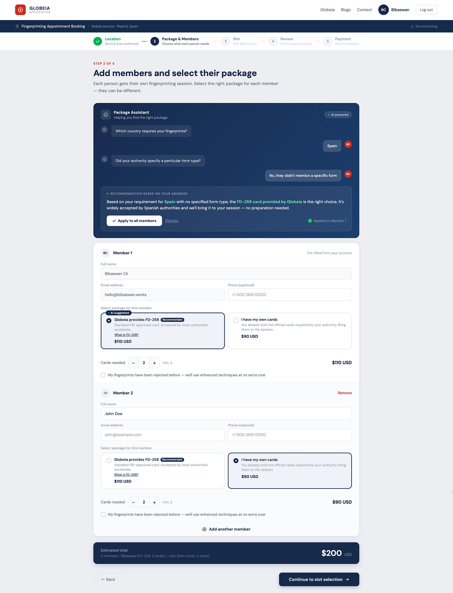
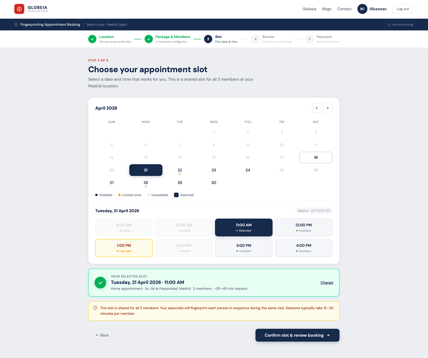
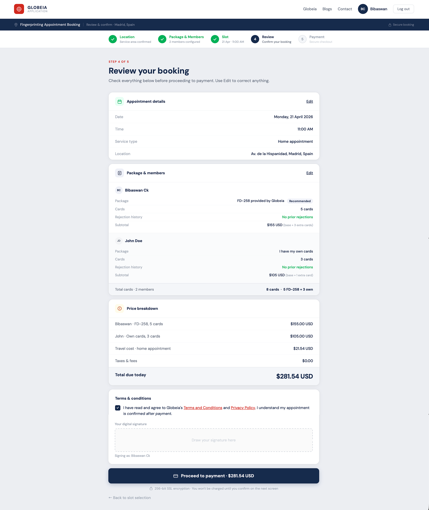
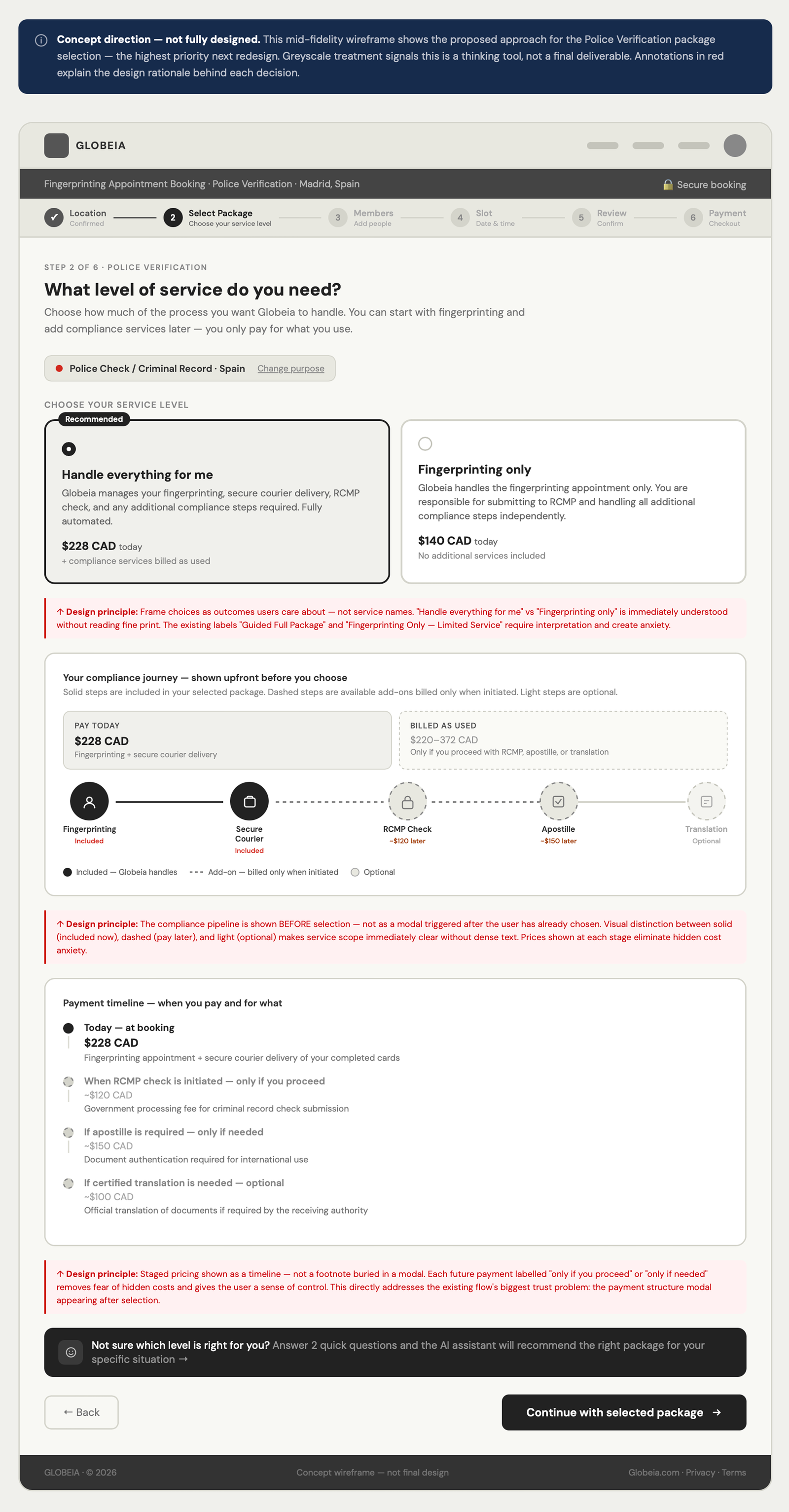
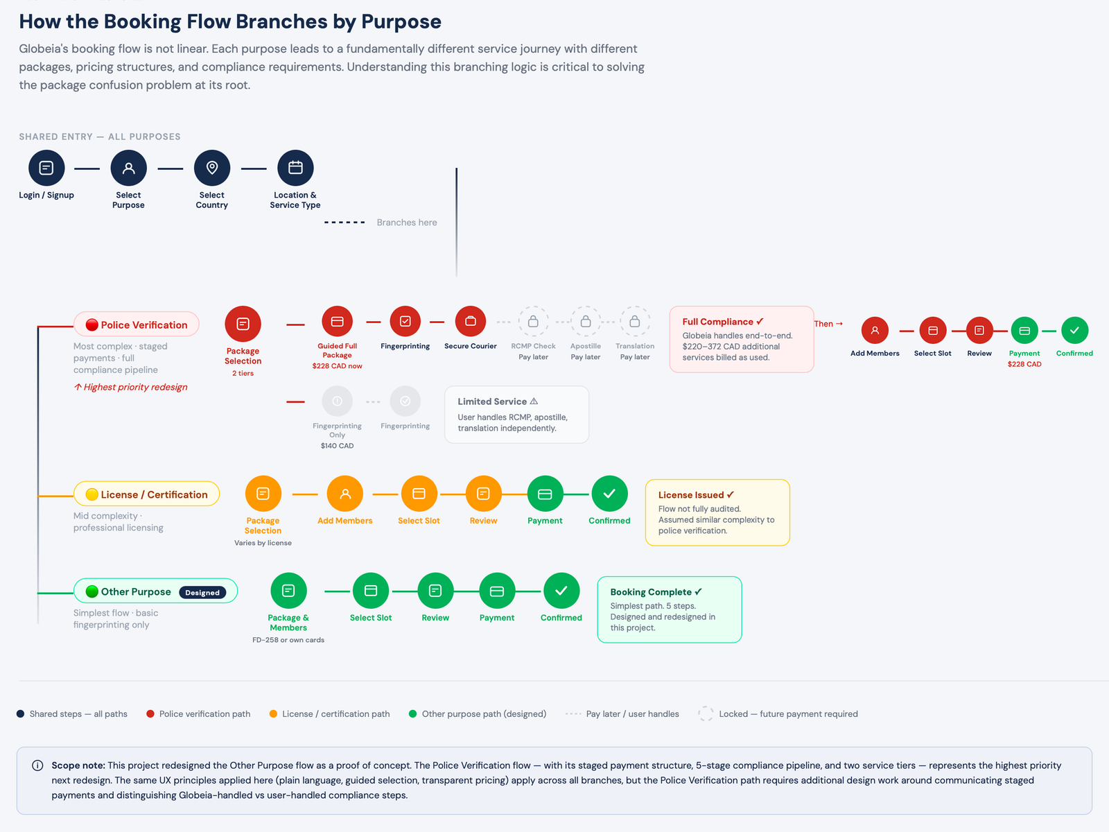
Identified 3 critical friction points, redesigned 5 key screens, and proposed an AI Package Assistant that eliminates the highest-anxiety decision in the flow. Demonstrates full UX methodology: audit → IA → flow redesign → hi-fi.
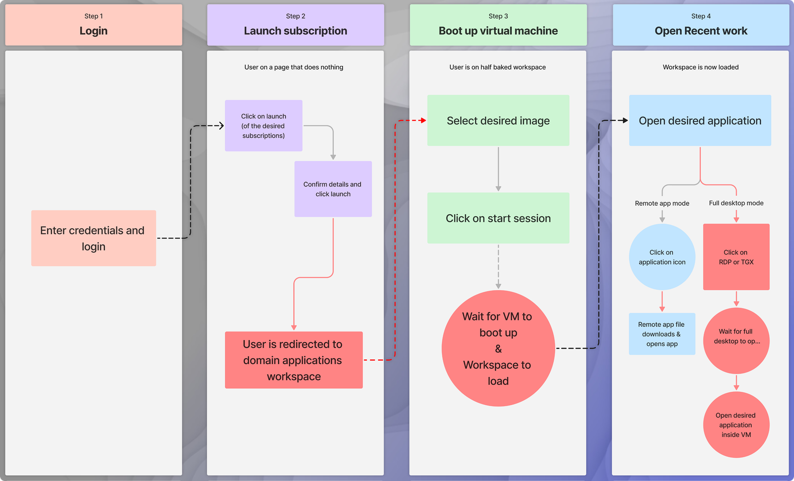
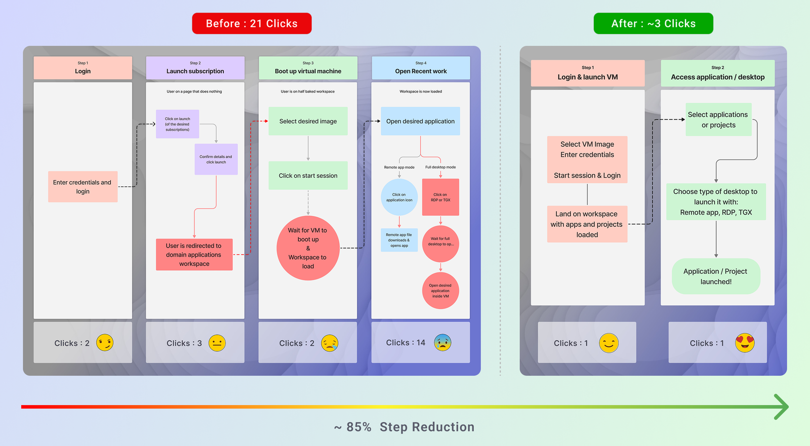
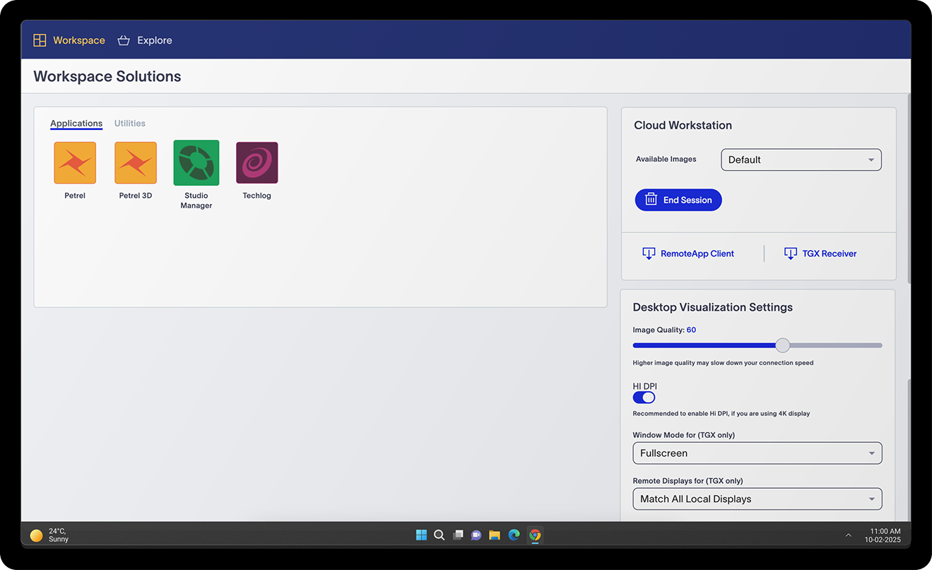
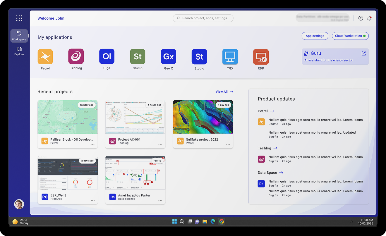
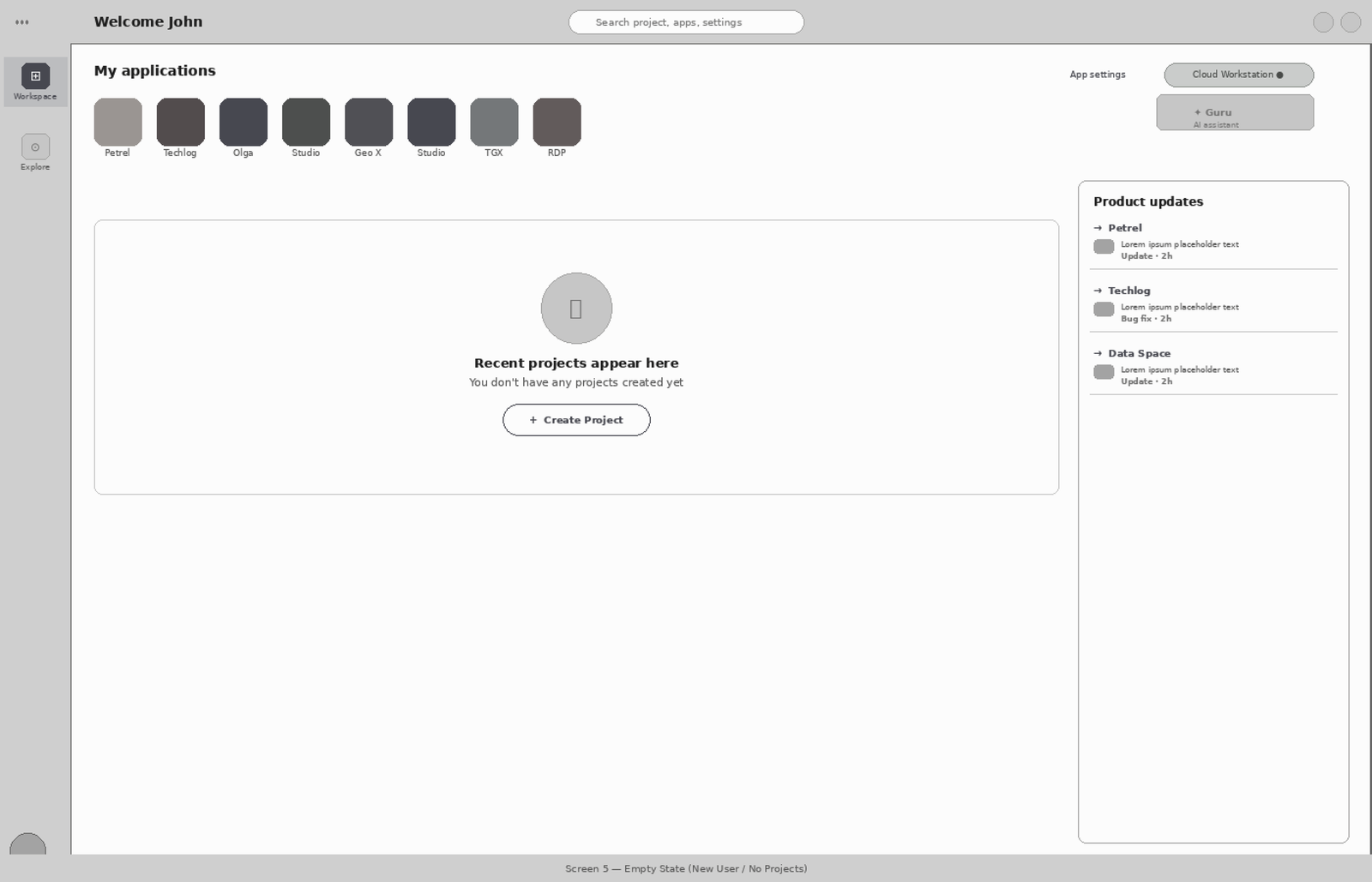
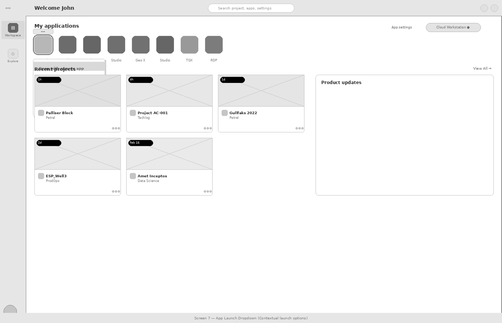
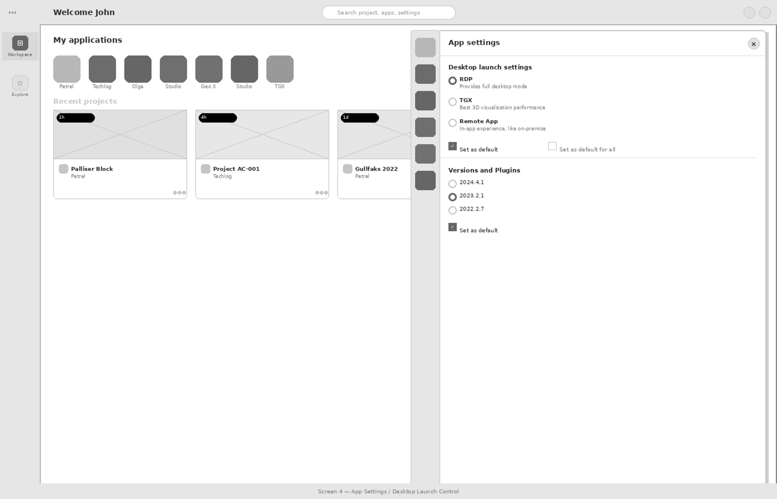
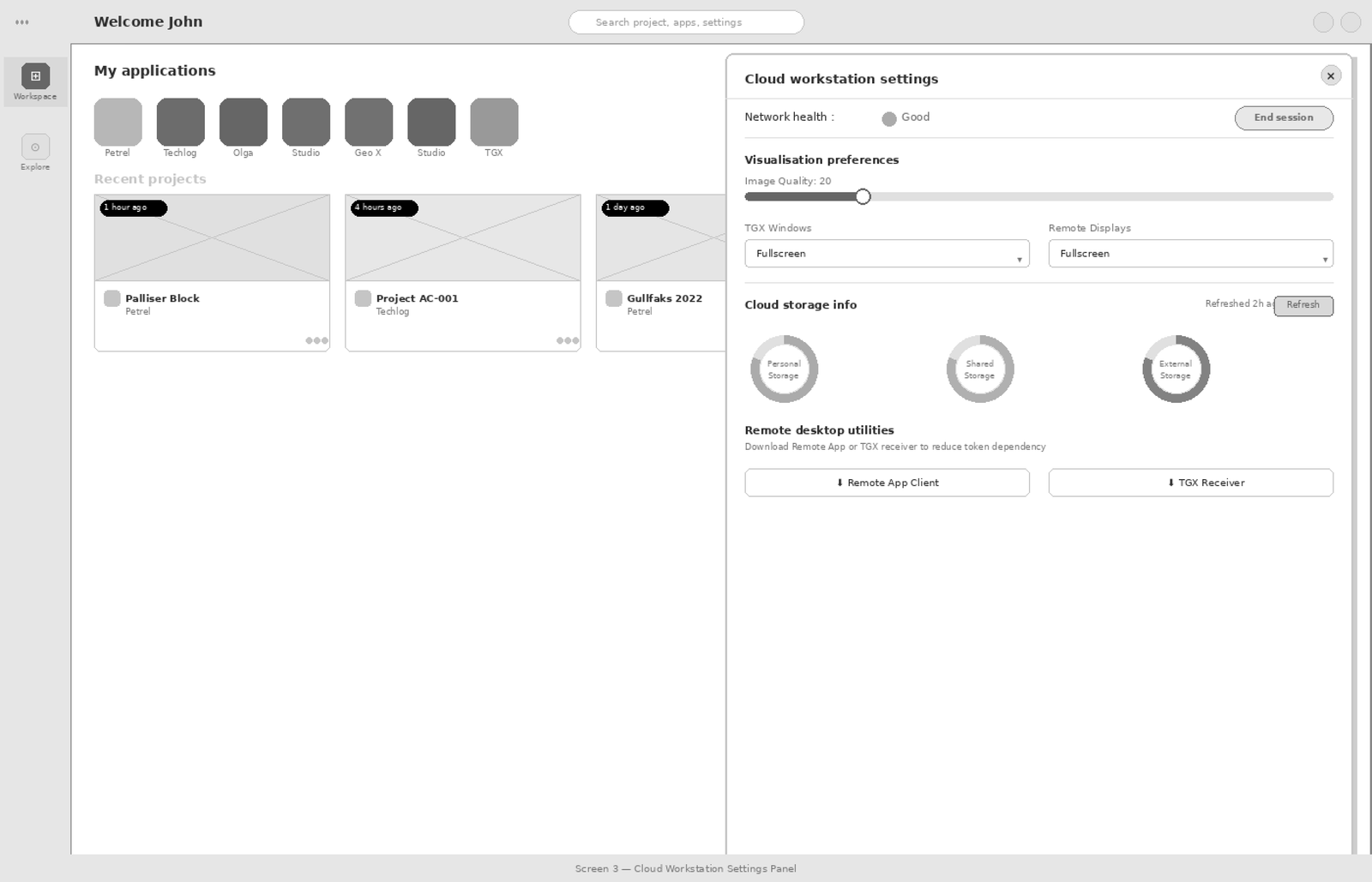
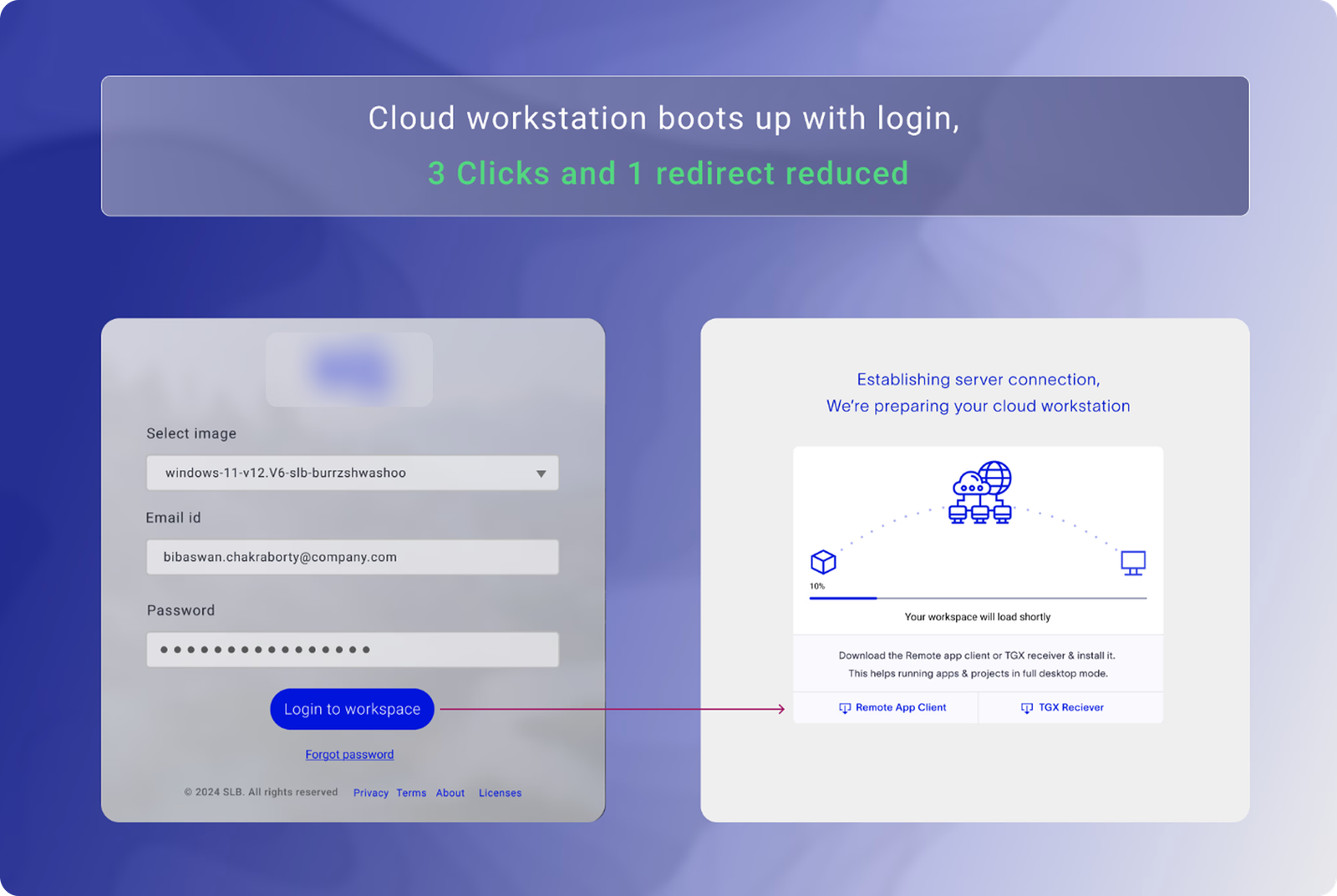
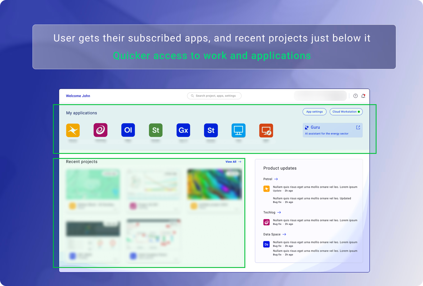
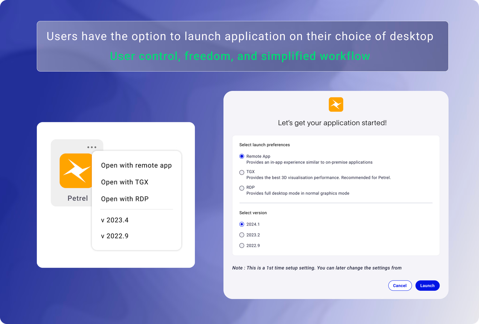
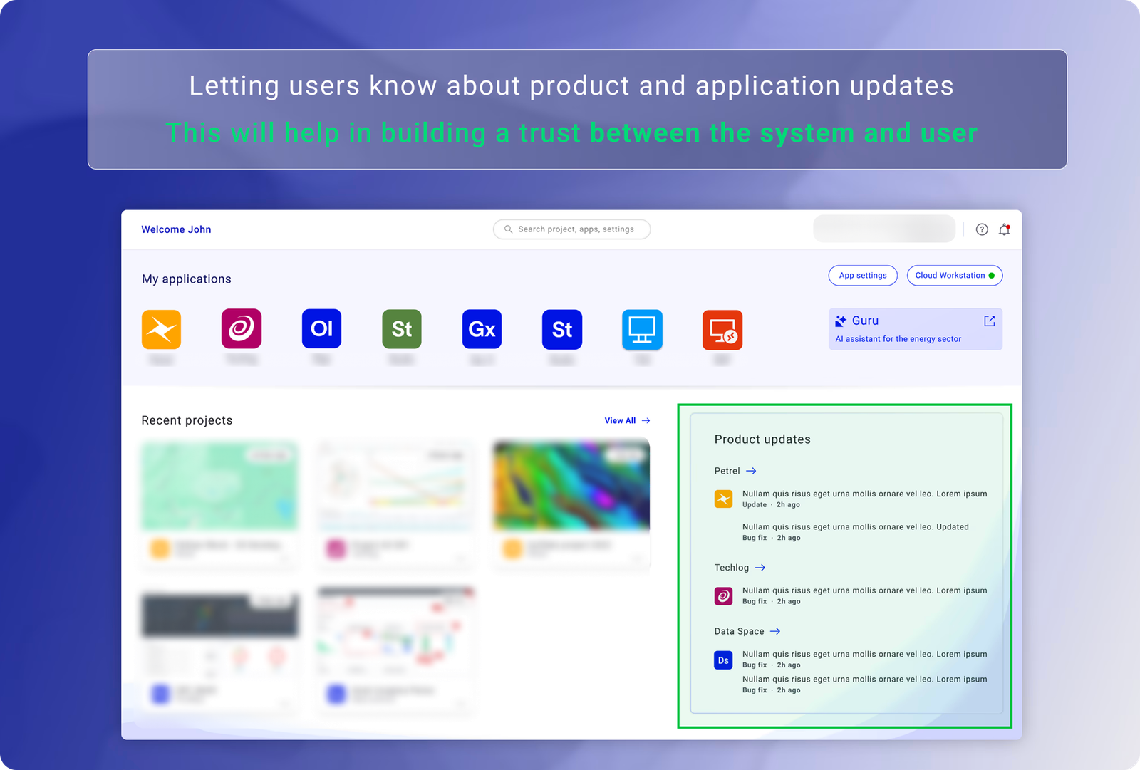
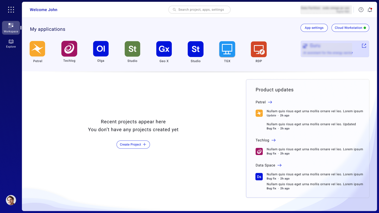
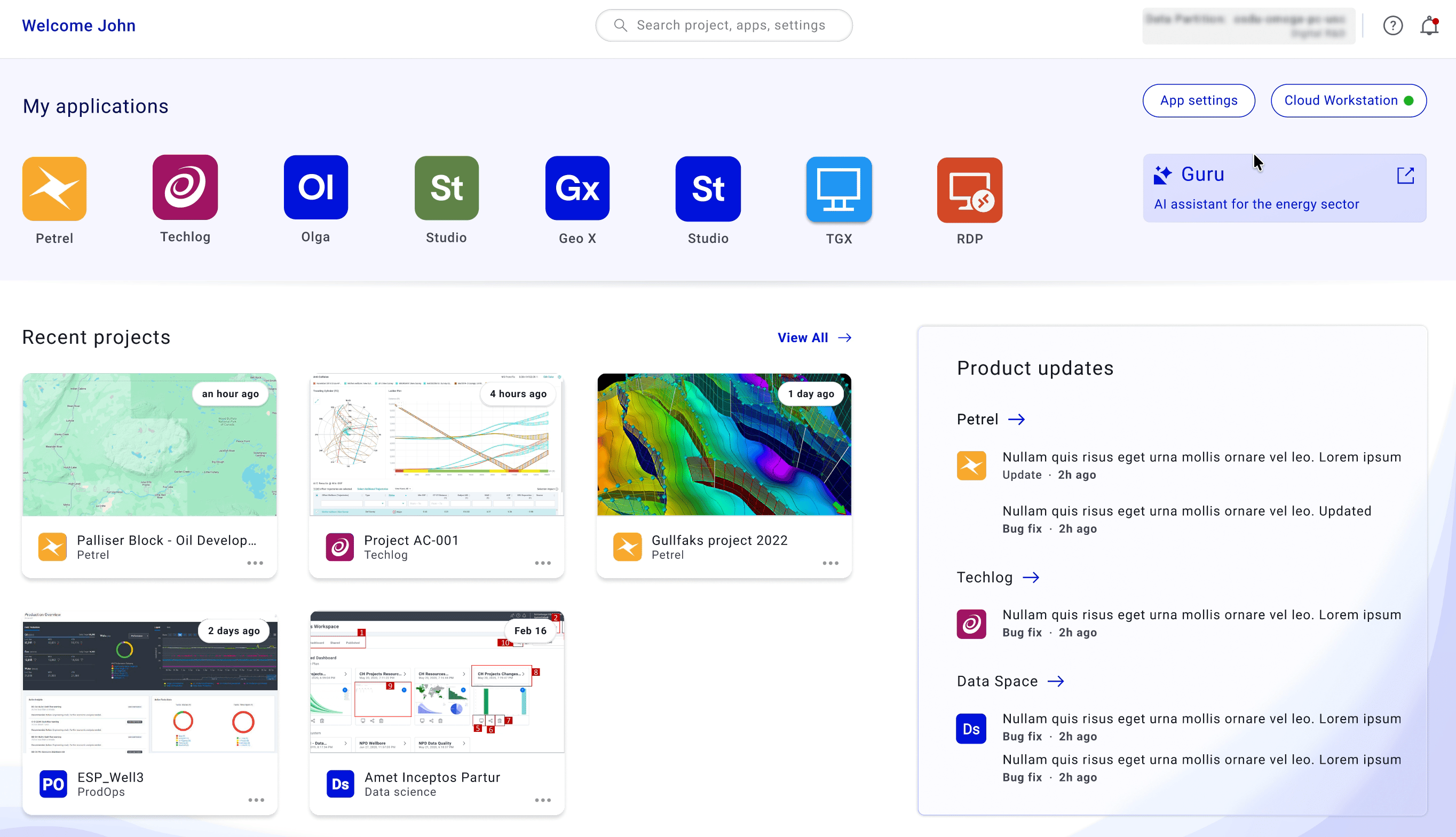
Reducing Enterprise
Workspace Friction
by 67%
Redesigned a mission-critical geoscience workspace to unblock cloud migration — confronting 21-click complexity, navigating 24 months of stakeholder alignment, and rebuilding around how geologists actually work.
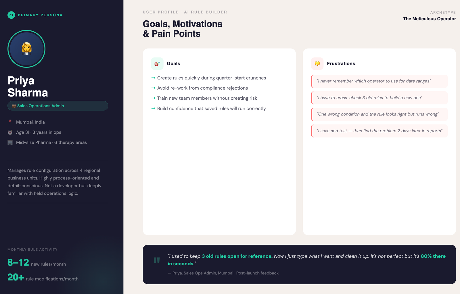
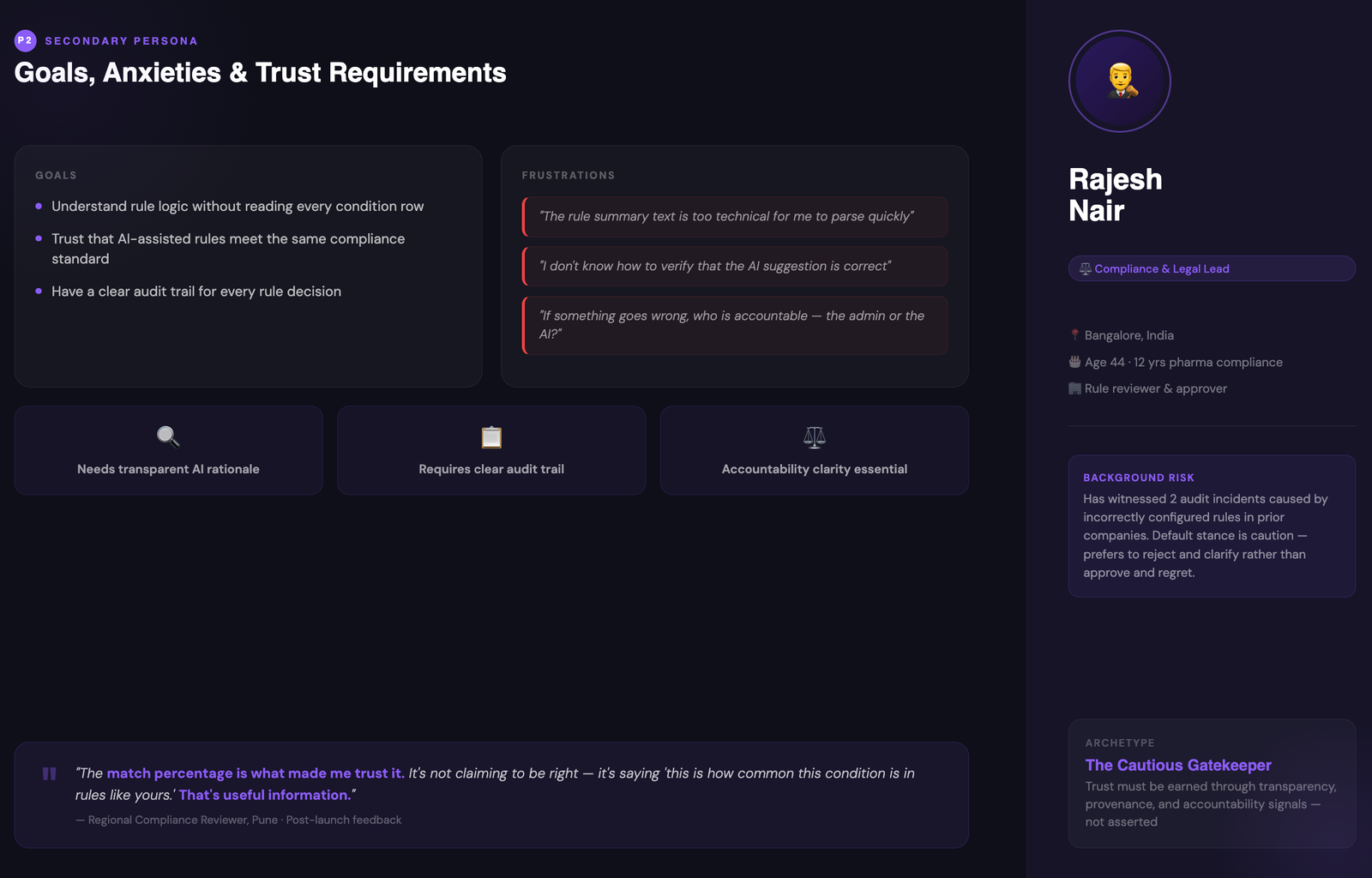
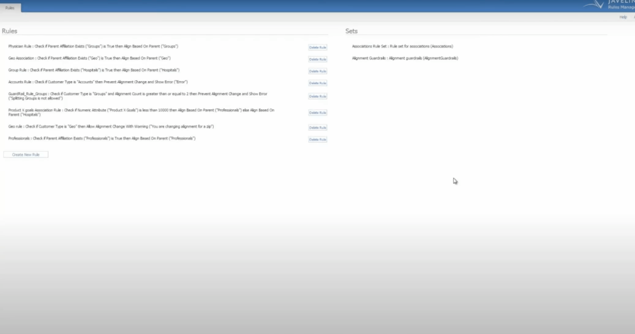
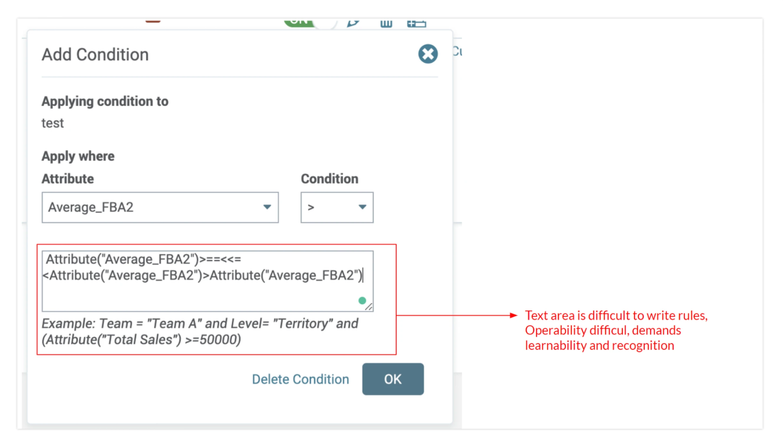
Simplifying complex
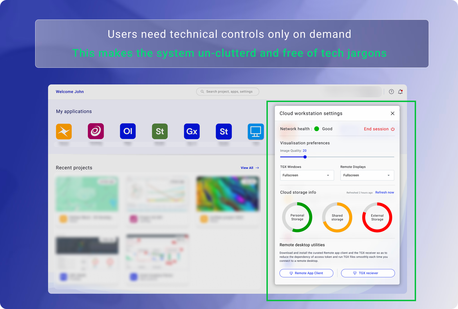
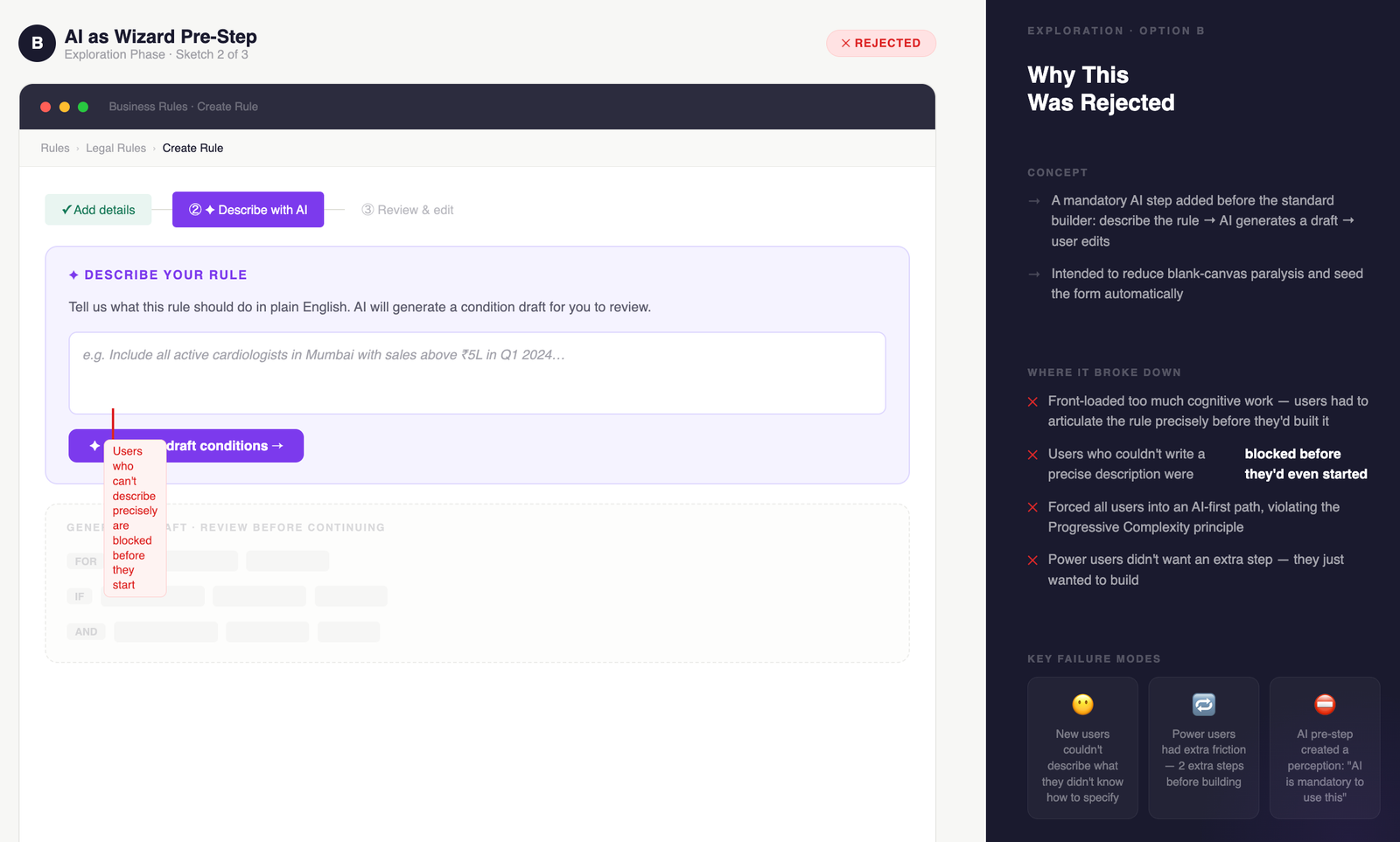
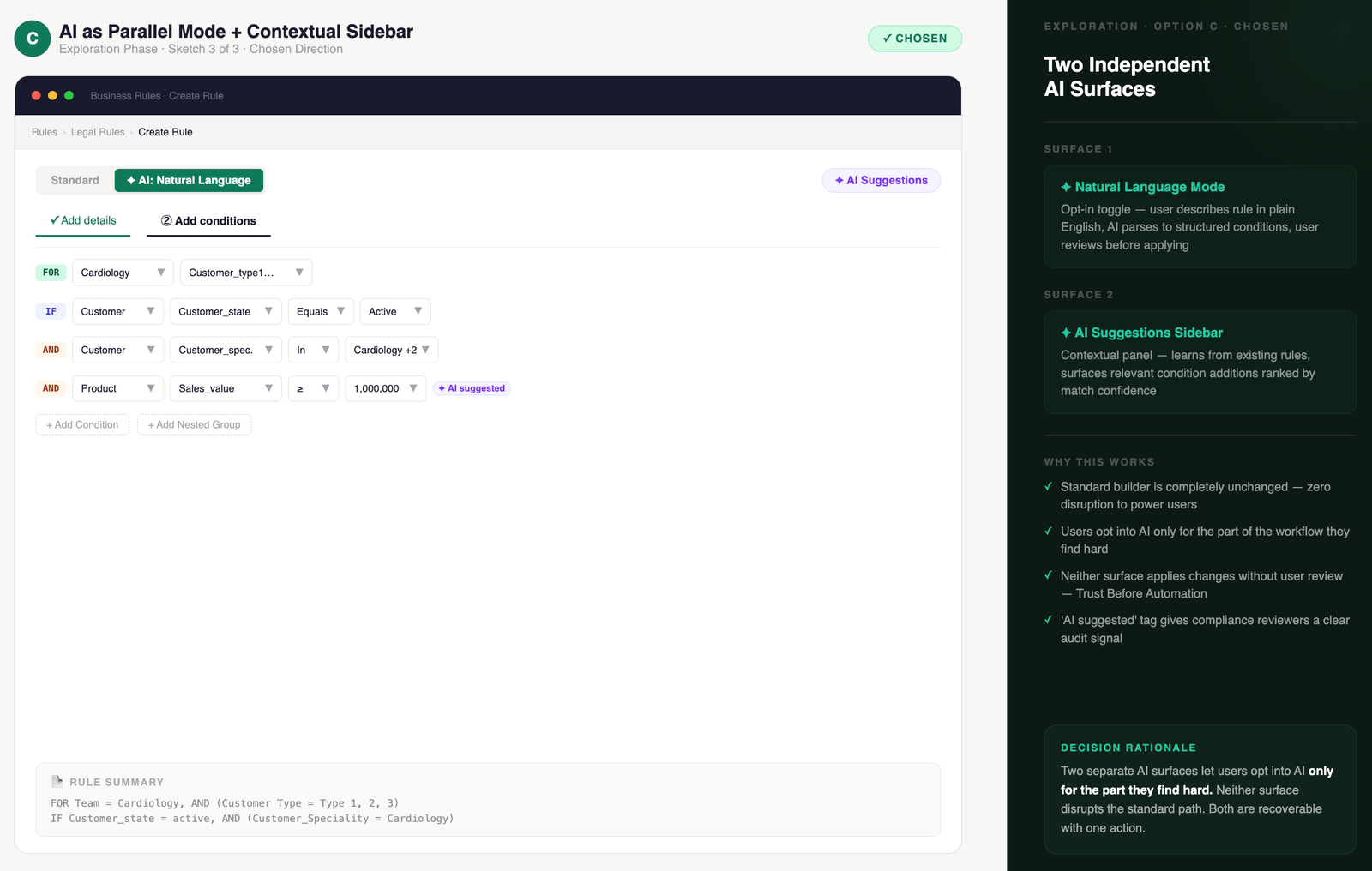
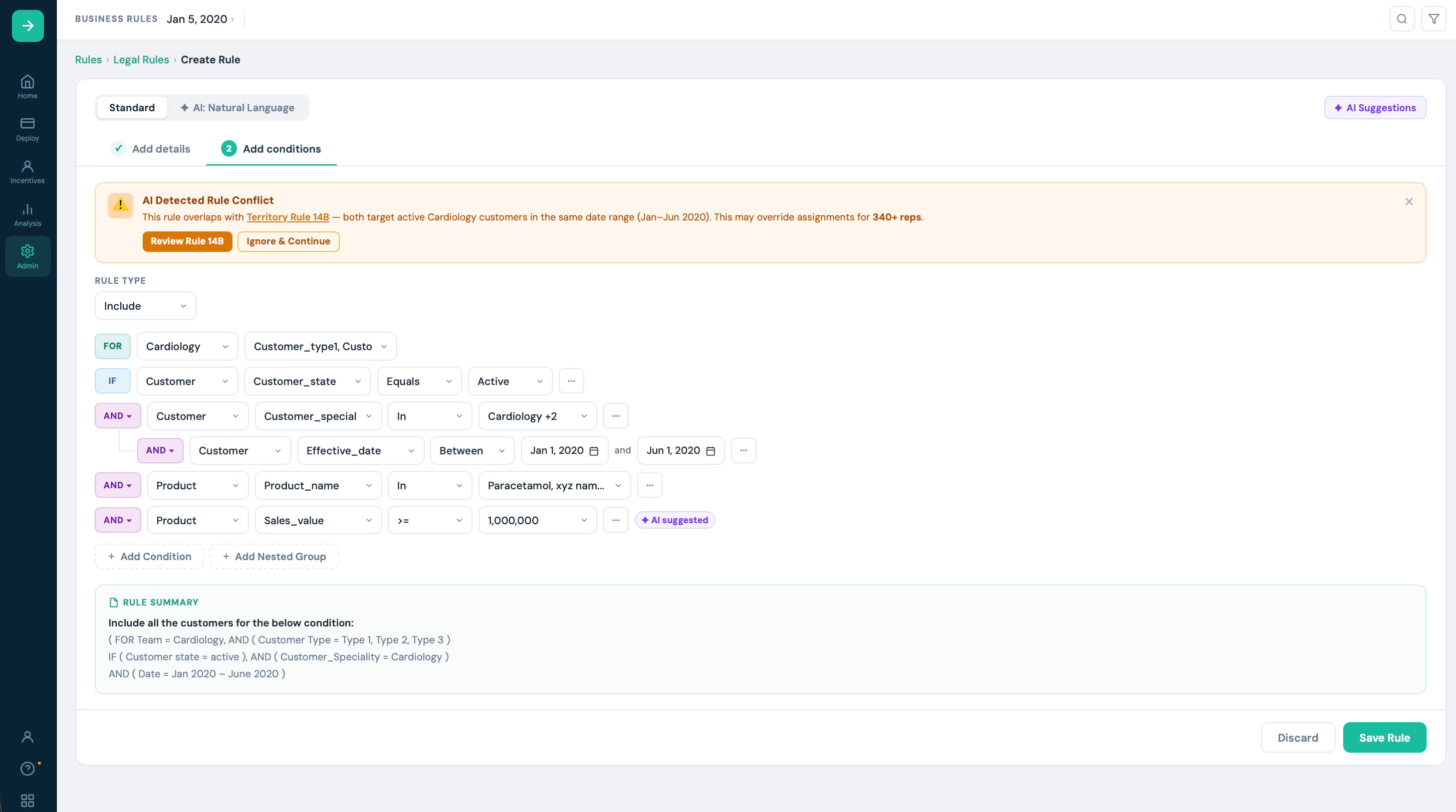
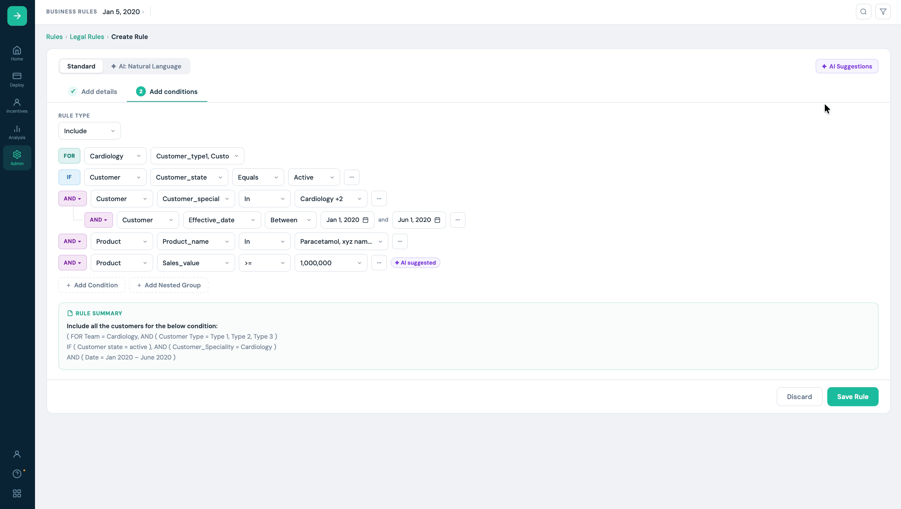
Business Rule builder
with AI assistant
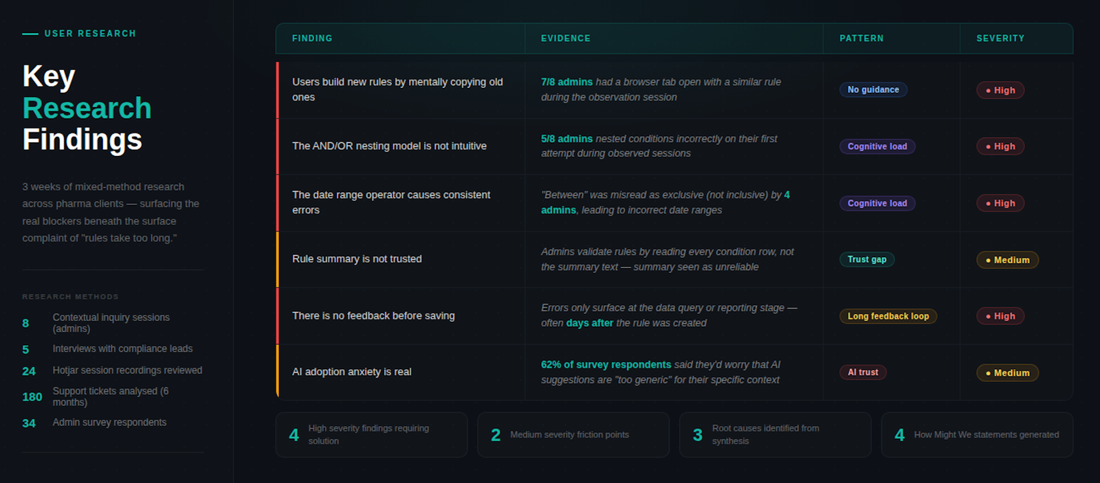
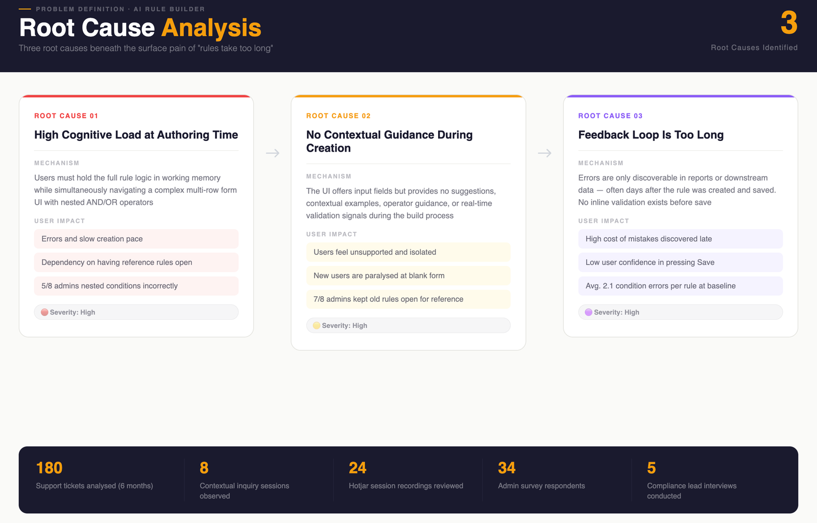
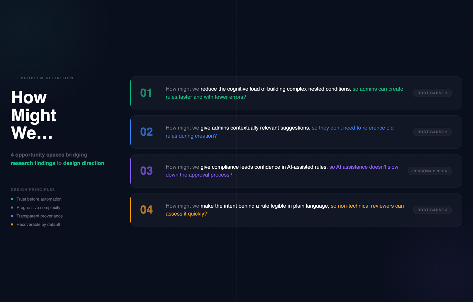
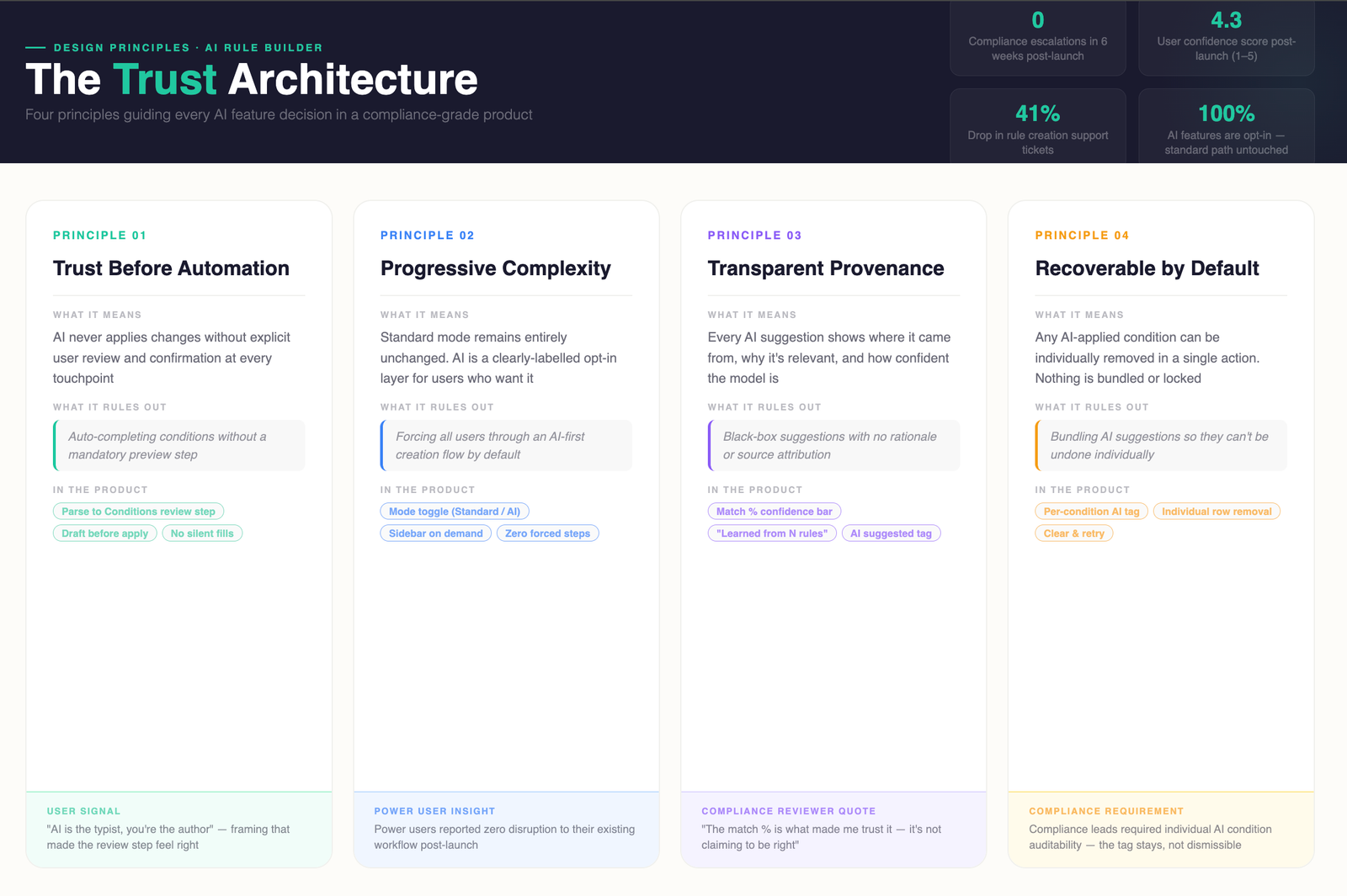
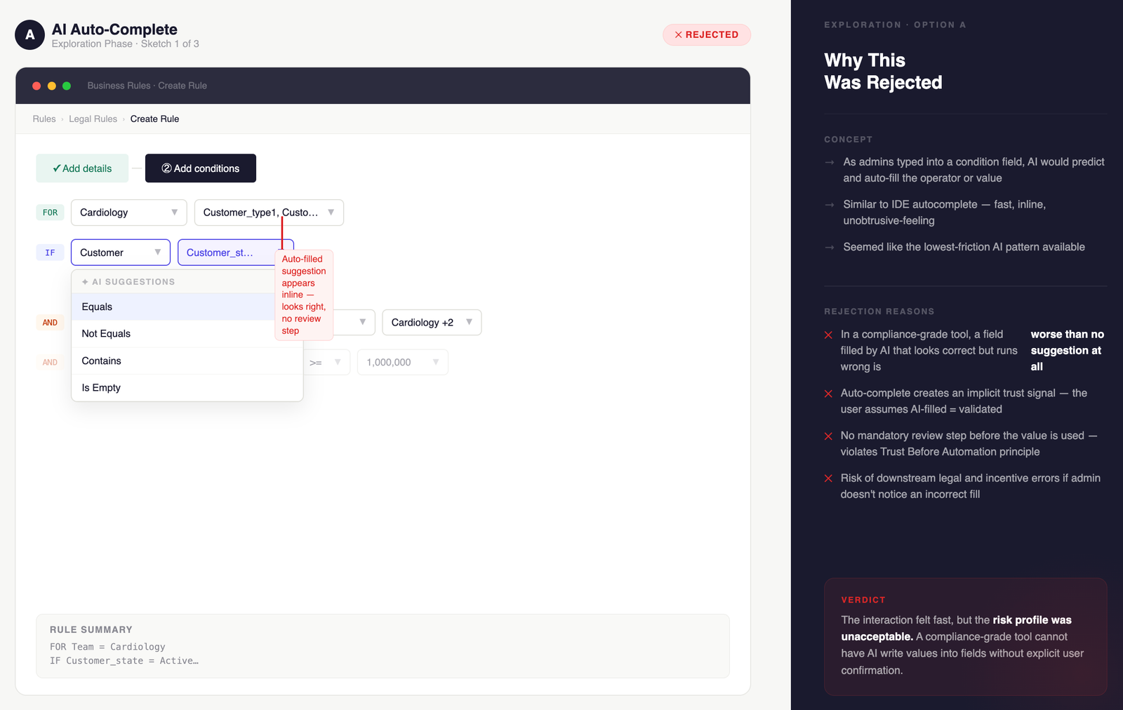
Redesigned a multi-role admin system for pharma SFA — serving expert managers and occasional users with opposite needs. AI integration cut rule creation time by 76% without disrupting power users.

Clinical Reporting Tool:
100% Team Adoption in 2 Weeks
End-to-end redesign of a pathology reporting system — from zero engagement to full team adoption in 14 days through targeted workflow intervention, not a visual refresh.
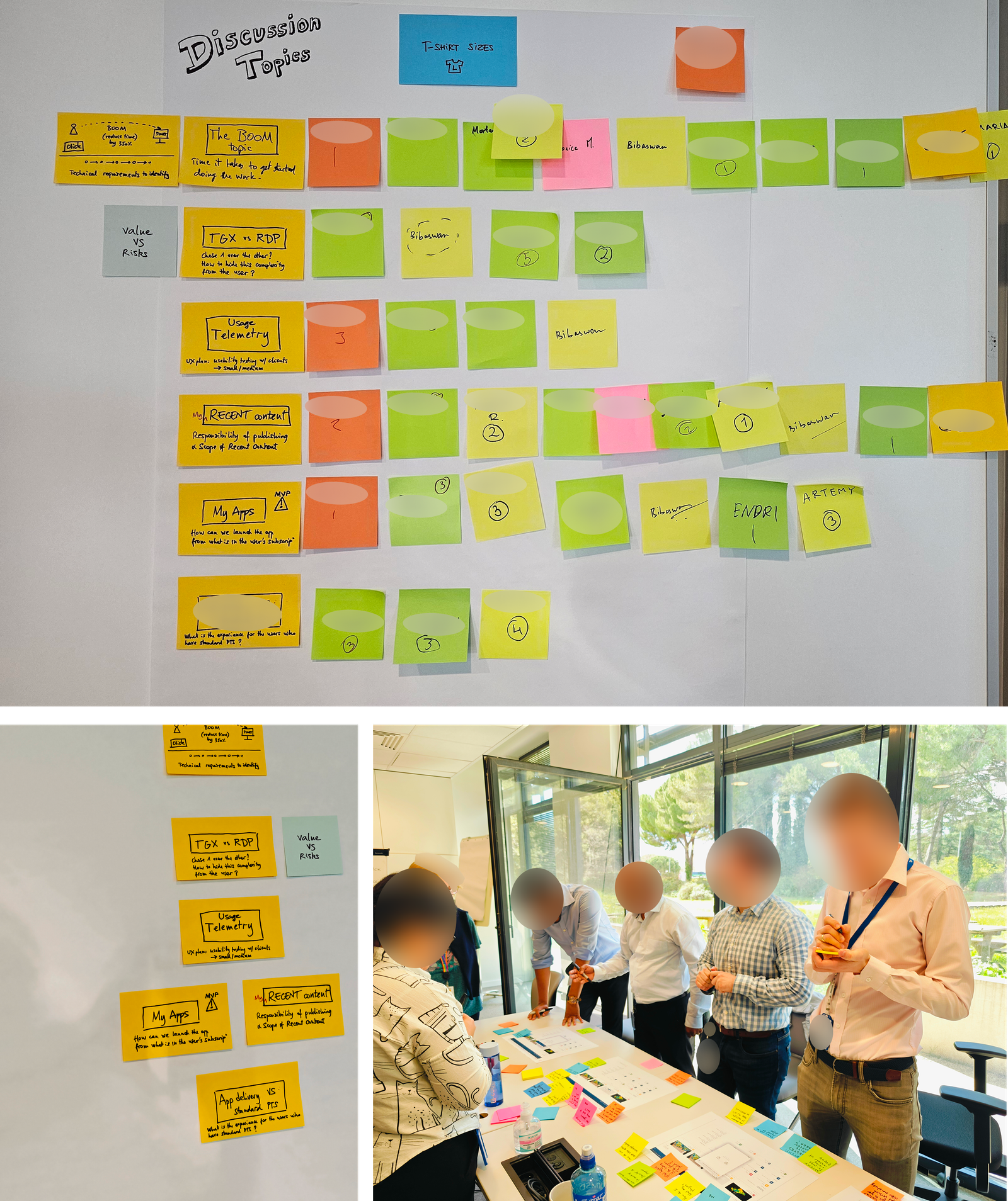
Design System for Complex Domain Workflows
Scalable component library and design language for a multi-product enterprise platform — built for domain experts across global teams, with governance that survived 3 product teams contributing simultaneously.
Outcomes over outputs.
Always.
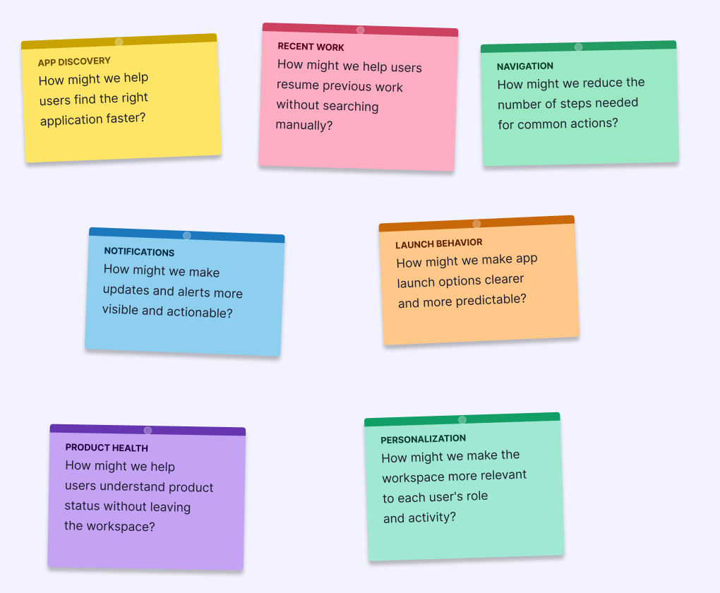
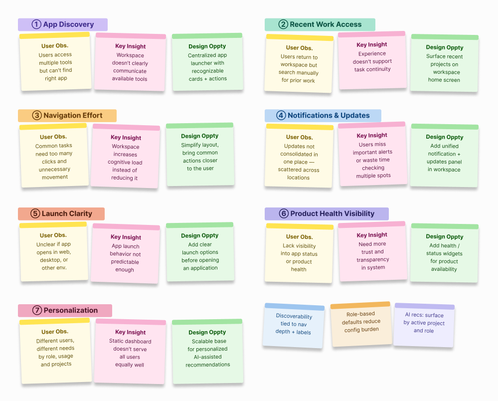
Enterprise work fails when designers don't understand what users actually do. I embed in the domain before touching a screen — learning the data models, the role hierarchy, and the workflows that already exist.
Enterprise products serve multiple user types simultaneously — admins, operators, reviewers, and viewers with conflicting needs. I map every role before designing any flow, because the admin experience shapes everything the end user sees.
I find where workflows break — not where they look broken. Click depth, cognitive load, task failure, and support ticket volume are the real diagnostics. Heuristic audits confirm; usage data reveals.
Every screen is a decision point. I design for the choice users need to make — not the feature the team wanted to ship. IA defines the structure. Interaction design reduces the friction at every step.
Design is a hypothesis. I test it, instrument it, and hold myself to the outcome — not the deliverable. Post-launch adoption data, support ticket trends, and task success rates are the metrics that matter.
Engineering wants to ship. Sales wants features. PMs want velocity. I navigate these pressures by keeping research visible, tradeoffs explicit, and the cost of bad UX quantifiable. Data beats opinion in every stakeholder room.
What I bring to
complex products.
Five years of enterprise UX means building fluency in the systems that make B2B SaaS hard — not just the screens that face users.
What they say
He doesn't just design screens — he redesigns how the team thinks about the problem. The workspace project would have shipped as a visual refresh without him pushing for the architectural rethink.
In 24 months on the geoscience platform, I watched him win three separate arguments with engineering using research, not opinion. Stakeholders started asking for him in scoping calls.
Rare combination: rigorous with research, fast with a prototype, and willing to tell a VP why they're wrong about their own users. That last quality is the hard one to find.
Chakraborty
Have a complex workflow
that needs untangling?
7 years of enterprise UX across pharma, oil & gas, and healthcare. I work best on hard problems where design decisions have real operational consequences.